

Let's find out who's been going to the White House the past few years...
An introduction to one of the best data tools for any reporter of any technical level
This is a hands-on walkthrough for NICAR 2012. It will take place on Friday, from 2 – 2:50PM in the Jeffersonian/Knickerbocker room. It will be led by Dan Nguyen (@dancow) with help from Joe Kokenge (@josephkokenge) of ProPublica.
You’ll learn some of the basic (yet very powerful) features and we’ll even do some examples of interesting journalism. No statistics, programming, or Excel skill required. Watch the official video tutorials here. Read my tutorial I wrote showing how Refine was essential in our award-winning Dollars for Docs investigation at ProPublica.
Google Refine is called: “a power tool for working with messy data”
If you haven’t tried Refine yet, then you’re missing out on the potential stories and insights that Refine can easily (and sometimes exclusively) find in data.
It doesn’t matter what skill level you have. Refine, which works right out of your browser (and offline) is one of those unique tools that is as equally useful to those who have never left their click-and-drag interfaces as it is to the most anal-retentive detail-oriented data analysts and command-line-loving power programmers.
In this lesson, I’ll start at the very basics: opening a file with Refine, doing basic sorting, searching (things that you can do in Excel, of course) to its easy-to-use data cleaning methods and then to how Refine can help you probe unfamiliar datasets to scout out a story.
There are, of course, about an unlimited number of ways that a dataset will do its best to raise your blood pressure. The two situations I’ll cover are:
You pretty much know exactly what you’re trying to find but you have no idea how messy/dirty the data is and if it’s even cleanable
You don’t even really know what’s in the data or what you should be doing with it. You just want a really easy way to explore it.
The two datasets I will be working with are:
FEC Individual Contribution Data – the list of citizens who have individually contributed $200+ to the political process
The White House Visitor Logs – everyone who has visited the White House during the Obama Administration (in the time period it chose to disclose), who they visited, and (sometimes) why.
(hopefully we’ll have time to do both)
This tip sheet is a work-in-progress…I will be filling it out through today and it should be done by the time of my hands-on session
The Federal Election Commission posts datafiles containing every federal political contribution from individuals in which the amounts are over $200.
The fields included are: “the ID number of the committee receiving the contribution, the name, city, state, zip code, and place of business of the contributor along with the date and amount of the contribution. NOTE: this file can be very large file.”
There are some obvious inquiries here. If you’re curious about the total for all of the individuals, then you don’t need Refine for that. You can just put this in Excel/Access and do the usual SUM equation.
| However, if you want to do something [like you’ve seen at OpenSecrets](http://www.opensecrets.org/politicians/contrib.php?cycle=2012&cid=N00003675&type=I “: Campaign Finance/Money - Top Donors - 2012 | OpenSecrets”), which purports to show total amount donated by individuals from a certain company or industry, then you’re going to need Refine to get you to the point where you make use of this data in Excel. |
Open the Google Refine application, which will either automatically open up a new browser window or tell you to point your browser to this address (this is a local address on your computer): 127.0.0.1:3333
Click the Create Project tab:
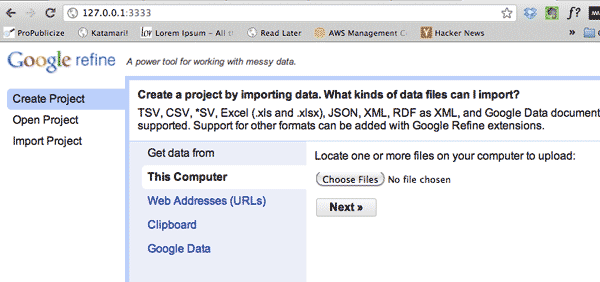
This will prompt you to point your browser to a data-file. As you can see, it supports a variety of formats, including CSV and Excel spreadsheets.
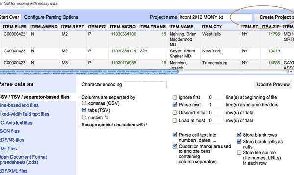
The data-file that I’ve prepared for this hands-on session has been re-formatted to be tab-delimited and I’ve pre-filtered it to include only Missouri and New York donors in 2012.
Download it here: http://bit.ly/nicar12-refine-fec
The next screen in Refine is a preview of the data. There’s not much to do here as Refine is pretty good at knowing whatever you gave it by default. Click Create Project in the top right to continue.
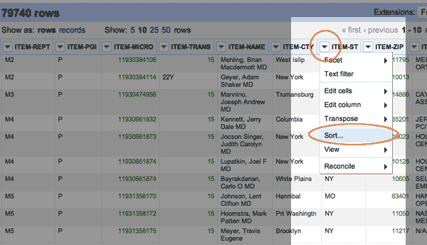
To get familiar with how spreadsheet/Google-doc’ish Refine is, let’s start with concepts you probably already know: sorting a spreadsheet by a column and filtering by value.
To sort a column, simply click on the down-arrow by the column you want to sort. This will bring up a pop-up box asking if you want to treat it as a number or text (this is useful if you have some mixed-data field). You can just choose Text for now.
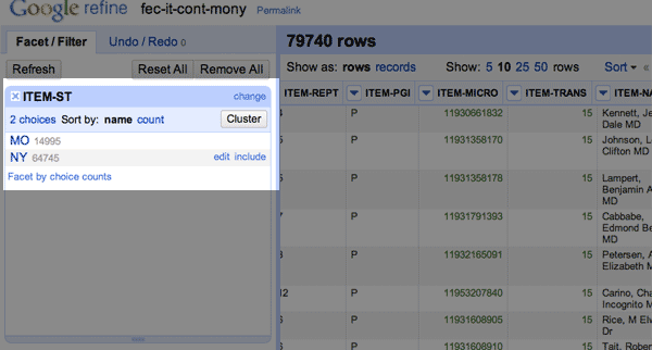
Let’s start with the state, or as the FEC calls it, ITEM-ST:
As you can see, one flaw – or rather, a design decision – of Refine is that it’s not too easy to scroll through a bunch of records at once. At most, you’ll only see 50 on a page.
It’ll become clear later why this is not a problem. For now, let’s try to filter the ITEM-ST column so that we can at least see the residents from New York, or NY.
Click the drop-down arrow on the ITEM-ST column header and choose Text Filter.
This will pop-up a menu on the left sidebar where you can type in some text.
So type in NY
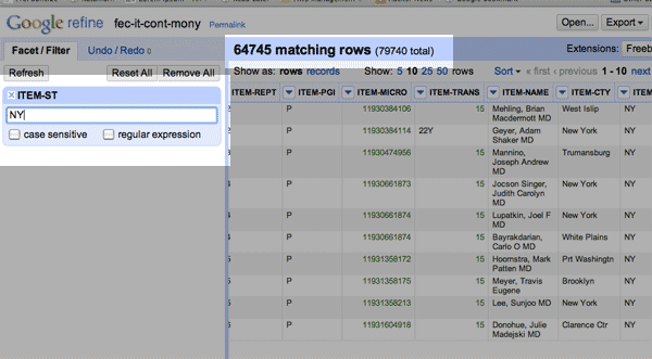
You’ll notice that all the visible entries now are from the state of NY. A more visible change is the total number of matching rows, which is 64,745 of the 79,740 rows total in our dataset (New Yorkers like to contribute more than Missourians, apparently).
OK, you should not be too impressed yet. We’ve only accomplished what you could do easier in Excel. The next section will show more of Refine’s power and ease of use.
One of Refine’s best user-interface features is something called faceting: that is, collapsing and organizing a data-set by whatever criteria you want. At its most basic level, this works a lot like filtering.
If the previous text-filter is still active, click the “Remove All” button.
Next, click on the ITEM-ST column header again. But this time, choose the Facet->Text Facet option.
Check out the left sidebar:
The text-faceting operation creates a little submenu in that sidebar. Clicking either NY or MO will auto-filter the dataset by those values. That’s a little more handy than the Text Filter action we used.
But we’ve just started.
Click on MO so that only the ~15K Missourians are shown (check the matching rows number).
Now that our dataset is filtered to the MO facet, do another Facet->Text Facet on the ITEM-CTY column.
The sidebar should now look like this:
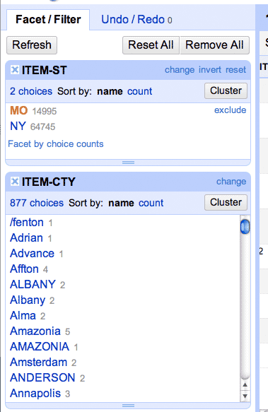
A recap of what we just did: ** * We did a **Text Facet on the ITEM-ST (state) column * We clicked on the MO (Missouri) facet to filter the dataset to 15K rows * We did a Text Facet on the ITEM-CTY (city) column
So what the ITEM-CTY sidebar box shows is all the unique city names found in the state of Missouri that donors filled in. There are, for example, at least four different ways that the city of Chesterfield is represented: “Chesterfield”, “Chesterfield,” [note the extra comma], “CHESTERFIELD” and of course, ‘chesterfield’.
If we wanted to find out all Chesterfield donors contributed, we’d have to find all the variations in that spelling before we could total their amounts.
(That faceted list of cities is sorted alphabetically. If you want to see which “city” value showed up the most frequently, just sort by count.)
Refine gave us quite a mess to clean up. It’s kind of amazing that this kind of problem, repeated a hundred or thousands of times over, can make a simple inquiry be a week-long project (if you don’t quite before hand)
Luckily, cleaning this up is what Refine does best.
Let’s start with the basic routine of cleaning, which will fix up the Chesterfield issue above.
The first thing you should do before you clean any column is to duplicate that column.
For our example, this means clicking on the ITEM-CTY column header and going to Edit column->Add column based on this column.
In the somewhat intimidating pop-up box, start by filling in a name for the new column. I chose “city-clean”.
Next, you’ll see that there’s this big textbox for an Expression, which Refine has set to the value of…well…value
This term, value, means that the new column will have the value of the column that you had clicked on.
If you’re not a programmer, there’s no time right now to explain that; if you are a programmer, you can guess that value is just the variable Refine is using to represent the corresponding value.
For now, change value to:
toUppercase(value)
Here’s what the pop-up box should look like:
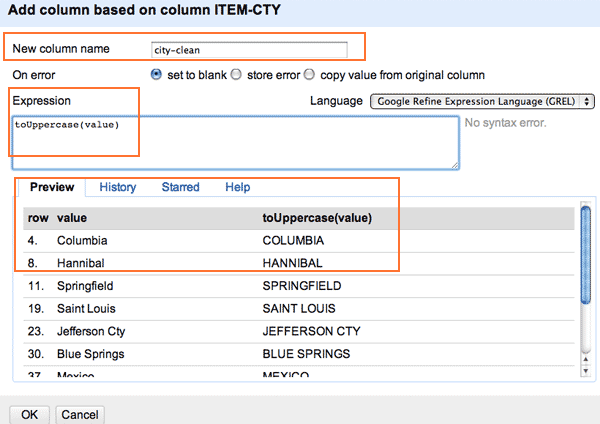
If you hit OK, you’ll see that we’ve created a new column called city-clean and that it contains the uppercased version of the ITEM-CTY values.
One of the best features that Refine has is the Undo option. If, for example, you wanted to delete that new column we just created, you just click on Undo. This applies to any other crazy operation you do on Refine.
But we are duplicating the city column for now just so that you can compare the original value with the cleaned one. It’s just good practice.
Remember that before we created that new column, we first faceted by the state of MO and then we clicked to filter the total result set so that only Missourians were shown.
This means that the new column we’ve created, city-clean, only has values for that subset of Missourians.
If you want to do everyone in our total set, you have to first unclick the MO facet and then do the Add Column operation. If you already created the column before doing so, you can use the Edit Cells->Transform action to do pretty much the same thing…it just won’t create a brand new column.
OK, make sure that you have your dataset filtered to just MO donors, but NOT to just a particular city.
Do a Text Facet again, but this time on city-clean. Now check out the Facet sidebar (you may have to scroll it down, or resize the already active facet boxes by clicking and dragging):
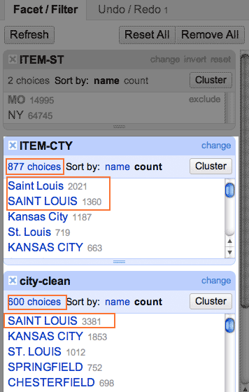
Look at that, instead of two different values for “Saint Louis”, we just have one – “SAINT LOUIS”. You’ll also see that instead of 877 choices, the list of unique values has been reduced to 600.
And we haven’t even started cleaning yet.
…
I didn’t have to get time to write out this very important section before the actual session. I’ll fill this out more, but you can pretty much get the complete scoop at my previous tutorial that uses the Dollars for Docs data.
(this is part of a rolling update…check back for more steps/info)
This tip sheet is a work-in-progress…I will be filling it out through today and it should be done by the time of my hands-on session
| The Obama administration recently announced with pride that [it has released more than 2 million records of White House visits](http://www.whitehouse.gov/briefing-room/disclosures/visitor-records “Visitor Access Records | The White House”) since it began disclosing them in 2009. It is the first administration to do so on such a scale, so give them credit for that. |
These records purportedly shed light on the people who get access to the President and his inner circle. But how useful is that raw data? And what can it tell us about the nature of the visits? Or about the state of the White House’s recordkeeping?
Because the dataset is massive, I’ve [narrowed it down to visits](http://bit.ly/nicar12-refine-wh “”) that involved just groups of one or two people. This removes the gigantic groups of tourists that also are named in the records. This may eliminate some notable names who show up in groups of 3 or a dozen, but we still have about 150,000 records to work with here:
http://bit.ly/nicar12-refine-wh
We’ll focus on these fields for now:
In the FEC example, we saw how Refine deals with tedious data cleaning. Thankfully, the more important fields of the White House visitor data are relatively clean.
So now the problem is: what do we want to find? Or, what is even there? If you, like me, have never been to the White House or have never taken part in any of the D.C. rituals, you may have no idea how or what these visits are like:
You may already have in mind names of people who you think are interesting, either visitors (such as prominent lobbyists) or visitees (Obama, his chief of staff, etc.). But what happens if those names aren’t there…? Rather than limit your inquiry to some obvious queries, Refine allows you to quickly view the big picture and the context. Sometimes what’s not there is worth a story in itself.
(Since I won’t be able to finish writing my notes/thoughts before my session today, you can get a good fix of what you’re in for in this story published last year by the Center for Public Integrity: “White House visitor logs leave out many “)
I’m going to assume you’re familiar with the Refine process. Create the project and load the data in.
The two data fields we’ll focus first on are:
So let’s create two additional columns, visitee_fullname and visitor_fullname. These will serve as our “clean columns” to work with.
This part is going to involve the Edit column->Add column based on this column operation
Warning: This next part is going to involve some programming jargon. I’m not going to explain it, just copy and paste the values for now. If you’re a non-programmer and are thinking “Whoa, I didn’t sign up for this”…well, you won’t have to learn programming yet. And even if you did, the good news is that the syntax we use here is very common across all other languages, so at least you aren’t dealing with something only useful in Google Refine’s universe.
We’re creating two columns that each are based on two other columns (first and last names). If you’ve used Excel before, you’re familiar with the CONCATENATE equation. The following is the same thing:
To create the visitor_fullname column, add a new column and name it visitor_fullname
And then use this as the Expression:
toUppercase(cells['NAMELAST'].value + ', ' + cells['NAMEFIRST'].value)
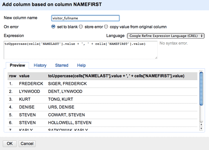
Note that we can’t just use the term value as we did when we were just deriving from a single column. We’re adding the last and first name together with a comma in between. And then uppercasing it. Not as pretty as the CONCATENATE function, but that’s because Expression allows for some extremely powerful programming that we won’t get to right now.
The same process as above, with this Expression:
toUppercase(cells['visitee_namefirst'].value + ', ' + cells['visitee_namelast'].value)
Should we start with examining visitors or visitees? Your choice, but since the universe of White House officials is much smaller than the number of people who could visit, you’ll at least see more names that you’re familiar with.
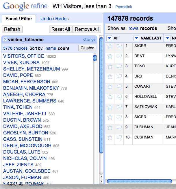
Do a Text Facet on the visitee_fullname column:
…
Notice that the President doesn’t seem to be near the top of the list? Let’s try adding a Text Filter to the visitee_fullname again. This will help narrow it down. Let’s try searching for “POTUS”:
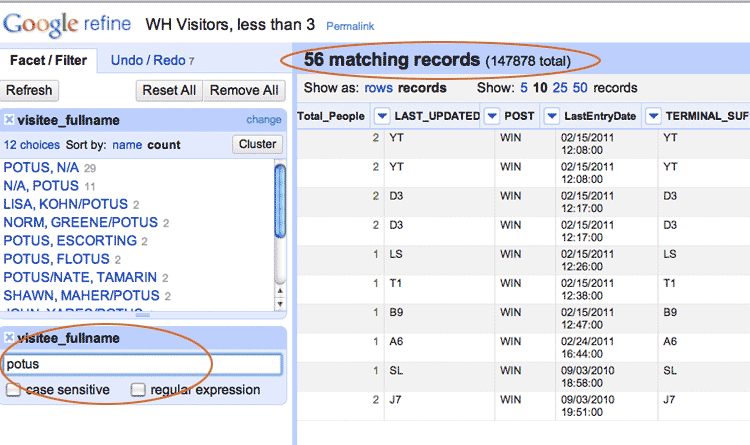
If you go back to the full 2 million record dataset, you’ll see that Pres. Obama (and his wife) get plenty of visits; any time a big honor ceremony is held, big groups of people are listed as visiting Pres. Obama. He just doesn’t get many small group visits. Which must make the ~50 people – i.e. the visitors – who are listed as having some small-group time pretty important/interesting.
…
in progress
(time permitting!)
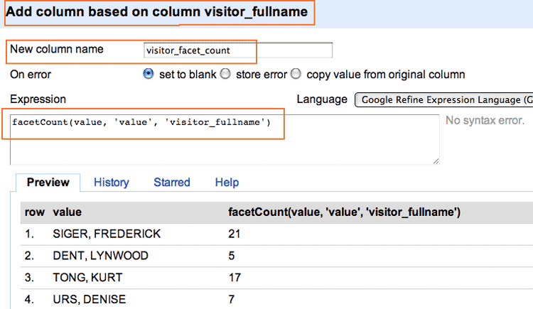
OK, we’re going to 2 more columns that are based off of the full_name columns These columns will simply contain the value of the frequency counts per each unique name. So, if “EMMANUEL, RAHM” appears 100 times, his “facet count” column will have a value of 100 for each of his records.
This is kind of a redundant step but if you have millions of records and faceting and clustering is causing your browser to meltdown, this can help you focus only on values that appear frequently.
Again, click on the full_name column and go to the Add Column action. The respective expressions are:
facetCount(value, 'value', 'visitor_fullname')
And :
facetCount(value, 'value', 'visitee_fullname')
Here’s an example of what your screen should look like. Make sure you’re adding based off of the correct column:
I’m not breaking new ground here, but I am showing you how to quickly find some interesting angles. If you’re interested in finding out more about White House elbow-rubbing, here are some pretty good reads:
Center for Public Integrity: White House visitor logs leave out many