Community
Discussion groups, chatrooms, mailing lists, and other places where people might know your name
Discussion groups and forums
Discussion groups, including mailing lists and Slack chats.

NICAR-L
Rjournos
Organizations
Professional organizations and etc. TK
National Institute of Computer-Assisted Reporting (NICAR)
Newsletters
news but by email
Numlock News
Portfolios of work
How do data journalism people showcase their work? here you go
Matt Waite
Lena Groeger
Al Shaw
Peter Aldhous
Maarten Lambrechts
Ben Welsh
A good example of a portfolio that uses mainly text lists to convey the scope of work and experience.
Job Boards
Where to find work. Are there enough of these though (tailored to data journalism)
IRE Job Center
Datasets
Datasets tk tk Lorem ipsum dolor sit amet, consectetur adipisicing elit. In aperiam ex explicabo, optio quae, exercitationem enim obcaecati minima mollitia. Minima alias dolores earum dolorum, fugit possimus aperiam debitis repudiandae adipisci!
Data catalogs and search portals
Data Portals, basically (TK curation)
Open Data Network
Search across official city Socrata portals etc etc etc Lorem ipsum dolor sit amet, consectetur adipisicing elit. Ipsum deserunt, exercitationem ad autem placeat debitis vitae earum doloribus laboriosam quaerat ducimus, quisquam repellendus sint culpa dolorem labore officiis maiores. Fuga.
MuckRock FOI Requests
Google Dataset Search
A search tool from Google that left beta in early 2020.
Data.gov.uk
Maybe the biggest and most well-organized public data repository.
Specific topical datasets
A shortlist of very interesting, or at least, very detailed public datasets across a variety of specific topics and beats.
California Public Sector Salaries
Interactives
tkviz bklasdfj
News Applications
news apps tk Lorem ipsum dolor sit amet. Basically, an interactive data site that is tied to a database and returns custom results/pages for the user
Credibly Accused
Visualizations
Cool charts
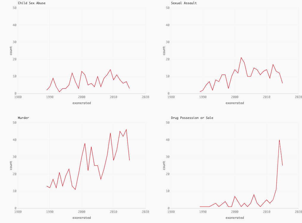
Human Terrain
- Population Mountains &emdash; An insightful narrative about the making of Human Terrain
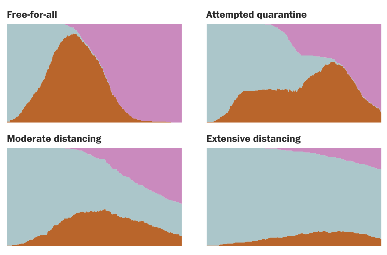
Why outbreaks like coronavirus spread exponentially, and how to “flatten the curve”
Outlets
Sites that do data journalism, or are about data journalism TKTK
Journalism outlets
Journalism outlets that have a heavy emphasis on empirical methods and data analysis.
Meta outlets
Sites about data journalism.
Source OpenNews
Specialty sites
Blogs and other publications more technical and specific to data analysis and visualization, and not necessarily journalism-focused.
Flowing Data
ProPublica Nerd Blog
Awards and Compilations
Lorem ipsum dolor sit amet, consectetur adipisicing elit. Quasi vero nam dolores, quis? Vel quia tempore modi, illum incidunt maxime aperiam accusamus nulla dolore repellendus, odit assumenda temporibus sed alias?
Sigma Awards
GEN Data Journalism Awards
Resources
Tutorials, books, and guides about the practice. Not meant to be a “how-to-code resource” TK TK
Books and Indepth References
Dedicated, in-depth online references, such as books.
investigate.ai
R for Journalists
Sports Data Analysis
Math with Spreadsheets for Beginning Reporters
Tools
A shortlist of tools; not so much an exhaustive reference but an illustration of the kind of things data journalists typically need to do day-to-day TK

Datawrapper
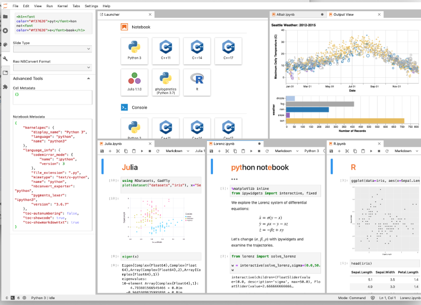
JupyterLab/Notebook
The Jupyter Notebook is an open-source web application that allows you to create and share documents that contain live code, equations, visualizations and narrative text. Uses include: data cleaning and transformation, numerical simulation, statistical modeling, data visualization, machine learning, and much more.
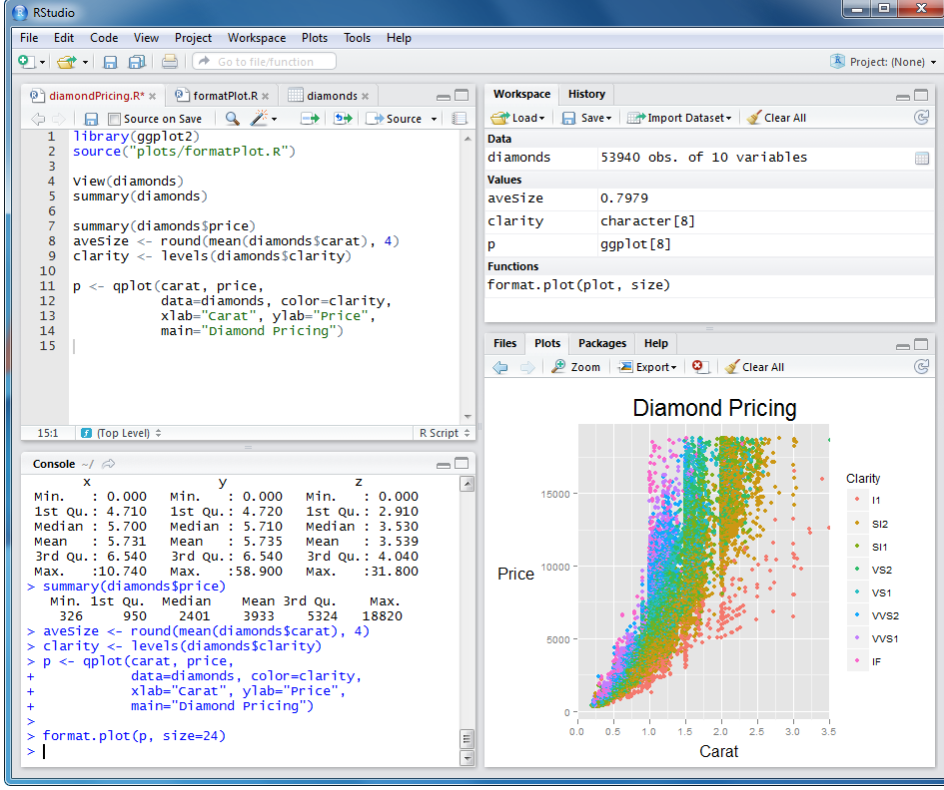
RStudio
agate


xsv
ripgrep
Repos
A selection of open source repositories of data and analysis. Or maybe it should just be news orgs?
the-pudding/data
Listicles
Even more lists and compilations. An appendix of sorts.
Guides
TK Not quite books, but not quite articles either
Curriculums and Syllabi
Data journalism as taught in schools and workshops
Some listings here: https://github.com/dannguyen/journalism-syllabi
Digital Frameworks
J298 Data Journalism
Algorithms, Lede Program
Tutorials
Technical walkthroughs
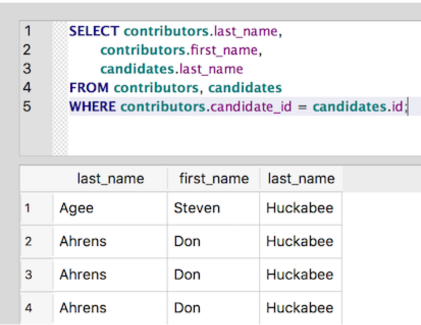
A Gentle Introduction to SQL Using SQLite
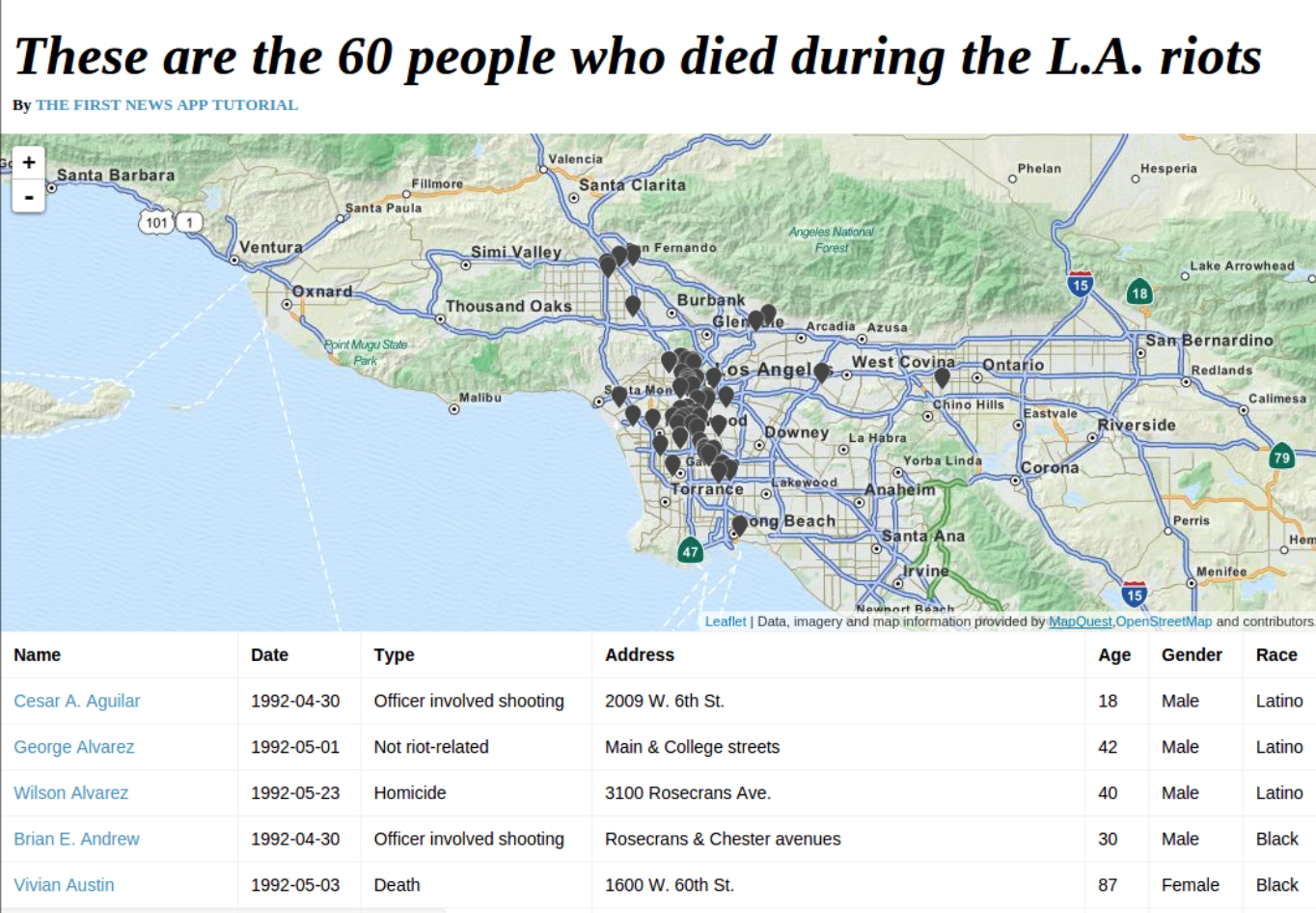
First News App

First Python Notebook
First Graphics App
Lorem ipsum dolor sit amet, consectetur adipisicing elit. Doloribus sequi ad placeat libero, modi quasi odio minima vitae. Sequi, consequatur? Optio ipsum molestias ea fugiat ex! Vero architecto eveniet quidem!
Beginner Excel tutorial
Lorem ipsum Dolorum dolor, enim impedit sint molestiae aspernatur, doloribus laboriosam maxime, ea delectus suscipit! Sapiente vero fugiat

Regex hands-on at NICAR 2017
Lorem ipsum dolor sit amet, consectetur adipisicing elit. Vero numquam officia at laboriosam minima quis pariatur nesciunt. Dicta animi labore, maiores cum mollitia harum officiis ut qui quasi. Obcaecati, at.

SQL Murder Mystery
Stories
clusters/stories.html: lorem ipsum TK this is the description field for clusters/stories.html
Profiles
Profiles and Q&As with data journalists, ranging from what they do to how they got where they are.
How 5 Data Dynamos Do Their Jobs

Ben Casselman: In Data Journalism, Tech Matters Less Than the People
In this “Tech We’re Using” NYT Q&A, economics reporter Ben Casselman describes using R to work with data too big for Excel and to automate the analysis of monthly reports. But Casselman contends that still he gets his best stories and insights the old-fashioned way.

From English To Tech, Sara Simon ’13 Shows What An Open Mind Can Do
Sara Simon, then with the NYT’s interactive news team, describes her path from 7-month coding academy to web developer for public news, to building tools for research and news gathering at the Times.
Q&A: Quartz’s David Yanofsky on coding as a journalist
Q&A: ProPublica’s Lena Groeger on data visualization and writing about design
StoryLab Academy: Data-driven Journalism with Lam Vo
Explorations
Longform explorations with data
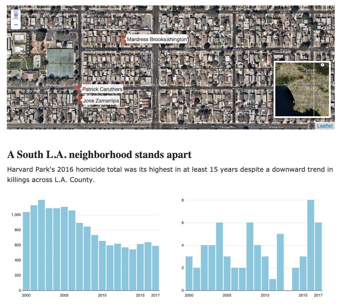
They Played Dominoes Outside Their Apartment For Decades. Then The White People Moved In And Police Started Showing Up.
Most 311 data investigations are frivoulous if not outright flawed. Here’s one that works within the limits and weaknesses of the data to tell an important story about racial tensions and gentrification. TK.
Investigations
Using data to comfort the afflicted and/or afflict the comforted

Suckers List: How Allstate’s Secret Auto Insurance Algorithm Squeezes Big Spenders

The Data Sleuths of San José
Essays
How-do-you-Do TK
Connecting with the Dots
What the Fox Knows
Design Principles for News Apps & Graphics
